Back to portfolio.
Concept projectFitness brand & web design
Nordic Fitness
Services
UI/UX · Web design · Content hierarchy
01 · Context
A fitness website has to communicate energy without making practical information harder to find. Classes, schedules and the next action should remain obvious even within a bold visual identity.
02 · Objective
Build an energetic, easy-to-navigate experience where classes and schedules can be found quickly.
03 · Design direction
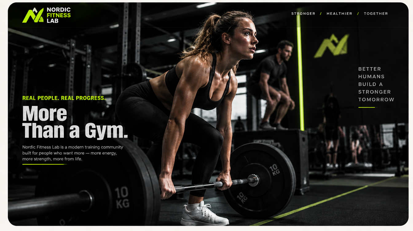
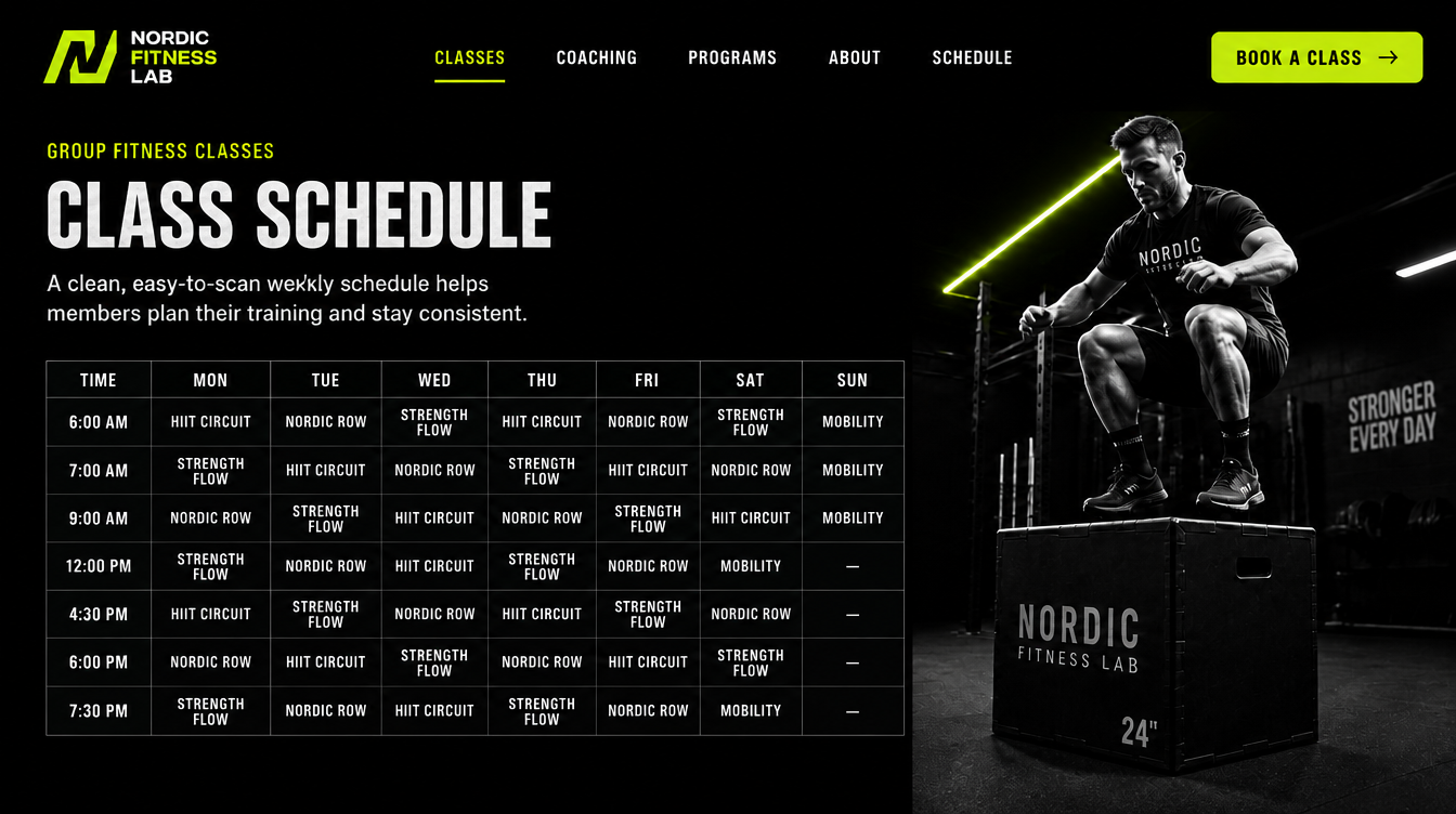
The interface pairs dynamic training imagery with a cool electric palette, strong typography and a schedule designed for quick scanning. Clear calls to action keep the path from browsing to choosing a class short.
01
Dynamic training imagery
02
Schedule built for quick scanning
03
Clear CTAs for class selection
Like this direction?